Car Insurance UI Enhancements
Compare the Market's mission is to make financial decision-making a breeze for everyone. They strive to provide clear and accurate information, empowering customers to find the right deals and make informed financial choices.
The Challenge.
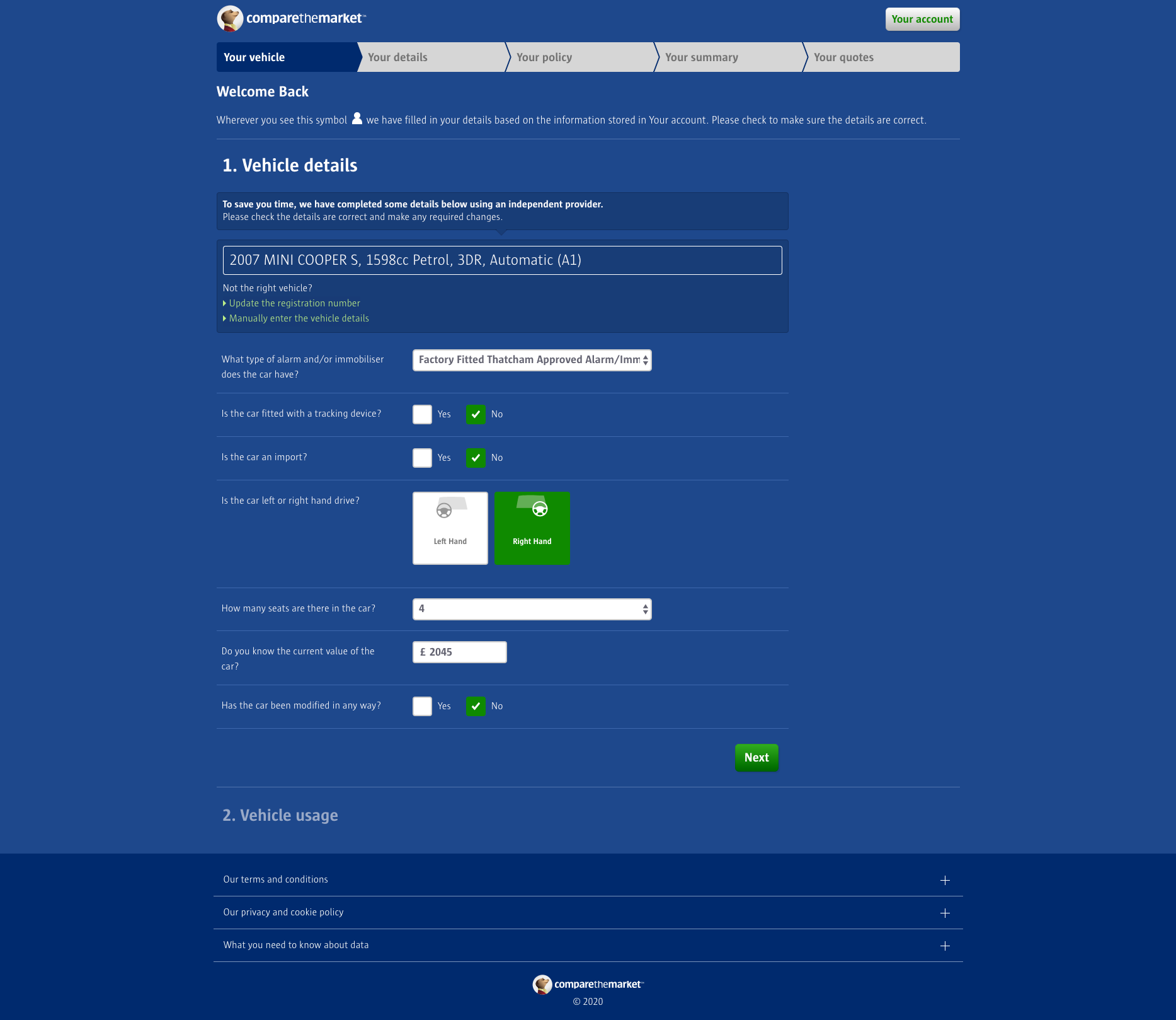
Compare the Market aggregate motor insurance. Customers answer questions about their vehicle, driving habits and experience, along with personal information.
When I joined the UX team, as part of my interview process I conducted a UI review of the current experience and observed a few things that I felt could be improved.
The Team.
I was the UX and UI designer working with a team of front-end & back-end developers, a product owner, a senior optimisation manager, and a user researcher.
Discovery.
I took the observations that I had made during my interview process to the team; the product manager, the optimisation manager and the front-end lead developer.
They signed off on me exploring these observations further.

Design.
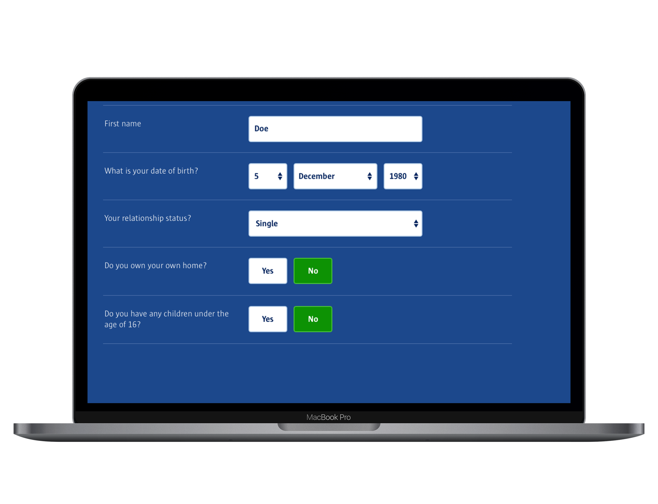
The two main observations were that the font size of the questions was too small at 14px. It was white on blue and quite a thin font. I suggested it should be a minimum of 16px.
Any changes made had to stay within the confides of the existing design. I worked with the lead front-end dev to test what size we could go to, and 19px worked for all breakpoints.
The second observation was the size of the inputs such as dropdowns and single selects. They were 30px, where I wanted them to be at least 56px to increase legibility and accessibility.
Reflection.
These were deemed such small changes in terms of development effort that we could “just do them”. So they were hard coded and released.
We monitored the experience for impact, and after a couple of weeks noted that we’d impacted revenue significantly year-on-year by £399k pa.